Playlist
Let’s start with the skinning options of the new playlist GUI.
Sections
As usual, the code goes into the [Playlist] section (will be applied to all playlists, if you have more than one), or into [Playlist0] etc. to target a specific one (the first one has index 0).
As Uli pointed out above, all sections now also support a .Light or .Dark suffix, and then they will only be applied in Light or Dark Mode, respectively. For example, the settings from [Playlist0.Dark] will only be applied to the first playlist, and only in Dark Mode.
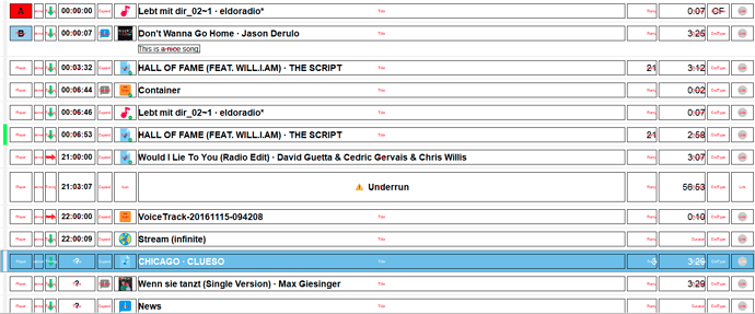
Debug Mode
The playlist has a special “debug mode” which, when enabled, displays frames and labels that will help you to deal with the new column grid. To enable the debug mode, just set Debug=on:
[Playlist]
Debug=on
This is how it looks like:
If you think that the debug text is to small, you can easily adjust its font size:
DebugFontSize=12
Columns
The playlist GUI uses a grid system with a number of columns to display the properties of the playlist item, like artist, duration etc.
Column IDs
Each column has an identifier which is used to adjust its properties. The available IDs are:
Player
Peakmeter
Timing
Time
Expand
Icon
Title
Attribute1
Attribute2
Attribute3
Attribute4
Attribute5
Attribute6
Attribute7
Attribute8
Ramp
Duration
EndType
Link
Please note that there is no separate column for “Artist”, but artist and title are both merged into the Title column. This is determined by the TitleDisplayMode setting, which determines whether only the title should be displayed, or artist and title, and if so, in which way:
Title
JoinTitleArtist
JoinArtistTitle
HSplitTitleArtist
HSplitArtistTitle
VSplitTitleArtist
VSplitArtistTitle
Title wil only display the title.
The Join values mean that title and artist (or the other way around) will be written next to each other with a separator (default: a centered dot) which can be customized through the following setting:
TitleSeparator=-
The HSplit values create two virtual columns of 50% width of the title column each.
The VSplit values will display title and artist above each other, similar to the Extended Display Mode in mAirList 6.x and below. You will also want to increase the RowHeight when you use this setting (see below).
Note that the TitleDisplayMode supports row selectors (see below), so it is e.g. possible to use a particular mode only for playling items:
PlayingTitleDisplayMode=VSplitTitleArtist
Attribute Columns
You can display up to 8 attributes (e.g. Album, Year) by using one of the attribute columns Attribute1 through Attribute8. You can assign an attribute to them like this:
Attribute1=Album
Attribute2=Year
Attribute columns which don’t have an attribute assigned will be hidden automatically.
Column Order and Visibility
You can select which columns should be used/displayed, and in which order, by using the Columns setting:
Columns=Player,Title,Duration
Columns not included in the list will be hidden.
If you want to go with the default column layout, but only hide individual columns, you can use the ColumnHidden setting along with their ID:
PeakmeterColumnVisible=off
Column Dimensions
The width of the columns can be adjusted with <ID>ColumnWidth:
PlayerColumnWidth=100
One column is always the “auto size column” which takes up all space not used by the other columns, and adjusts itself when you resize the window. By default, this is the Title column, but you could also choose to use a fixed width for the title and use another column for auto size:
TitleColumnWidth=300
AutoSizeColumn=Time
Columns are drawn with some extra space (padding) to the right and left, which can also be adjusted for each individual column:
TitleColumnPadding=20
Finally, you can choose whether the text should be aligned to the left, to the right, or centered in the column;
DurationColumnAlignment=Right
Note: This does not work for the Title column currently.
(to be continued)
