We now have V6.2 running.
All looks great, except for the Linked items Icons.
Can these be restored to the ones used in V6.1 ?
Regards,
Ferry
We now have V6.2 running.
All looks great, except for the Linked items Icons.
Can these be restored to the ones used in V6.1 ?
Regards,
Ferry
+1 Or the green red dots used in v4 v5 ?
Agree with Henk.
In v6.1 I changed the icons manually since I was not happy with the chains.
Well, we can change the Icons manually, I know…
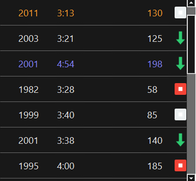
But Non linked items are now having a white box (forgot to set it to transparent Torben?)
Regards,
Ferry
Maybe Torben is living in a white world? ;D
You’re right, different row colors make the white box seem irritating. Maybe it can be changed in the skin ini?
However, the green arrow and the red stop sign look better (Henk, what do you think?).
Maybe Torben is living in a white world? ;D
You’re right, different row colors make the white box seem irritating. Maybe it can be changed in the skin ini?
However, the green arrow and the red stop sign look better (Henk, what do you think?).[/quote]
I think Torben is stil in his winter mood ![]()
The green arrow looks great the red box with the white dot, not so great. I tried to change the images but the square white box stays, my guess a transparency thing.
This was some kind of last-minute change, after visiting a customer and realizing that the previous visualization had a number of issues:
“Linked” and “end of chain” icons looked too similar.
No icon at all for “not linked” - people didn’t realize they could click into the last column to toggle link status.
The icon for “end of chain” is the “stop squared” icon from the “Color” icon set on icons8.com: https://icons8.com/icon/set/stop-squared/color
“Not linked” should be the same icon as “end of chain”, just grayed out; they should both indicate that playback will stop after this item.
I wasn’t aware that the middle part was actually white, not transparent, and I agree that it looks ugly on dark backgrounds.
Maybe you guys want to propose a different icon for “end of chain” and “not linked”. But it must be from the “Color” icon set on icons8.com, as all current icons are.
Does not matter to me…
I just put in a 32x32 transparent PNG named icon_notlinked.png into the Images folder.
So that did the trick.
Regards,
Ferry
quote=“Torben, post:7, topic:12096” after visiting a customer and realizing that the previous visualization had a number of issues:
Yes, I agree. Exactly that was the point why I changed those icons in v6.1 manually back to …
![]()
Hm, you are right - indeed, I learned it from shorty.xs (before that I didn’t know how to handle that “Link”; now it’s one of my preferred functions).
Good idea!
[quote=“Torben, post:7, topic:12096”]The icon for “end of chain” is the “stop squared” icon from the “Color” icon set on icons8.com: https://icons8.com/icon/set/stop-squared/color
(…)
“Not linked” should be the same icon as “end of chain”, just grayed out; they should both indicate that playback will stop after this item.[/quote]
I understand the idea on this, but: do you put special value on this sign?
Imho a Pause sign could send the same message: “Not a stop, but a break”.
Well, the squared icon, still with a white part in it, would be this one:
![]()
But since it will not look good in grayed out style, maybe this one would be better:
![]()
I dont’t like the color ![]() but it would look better grayed out.
but it would look better grayed out.
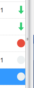
Or maybe just a red (gray) dot? Showed that to Tom once, but he didn’t like it 
I prefer the red dot for stop and Ferry his solution Blanco image for non linked items.
Circles for end-of-chain and not-linked.
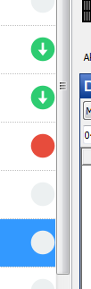
Or a “circled” green arrow?
Looks better  don’t know if it’s possible but I use next row color and playing row color (skin) would be nice if something is linked (next or playing) all the linked rows turn in the next or playing color.
“Plus one” 
(circled green arrow)
Can’t decide if I like the circled arrow or the regular arrow better…
We already have the simple green arrows left to the time field.
The circled arrow is a good compromise between the new design and the “old” dots Henk mentioned in answer #2.
I prefer the circled with arrow because my next row collier is green. With the circle you still see the with arrow  otherwise green against green you see nothing.
Minus one. Non-circled (regular) arrow. Easier to differ and a benefit for those suffering from color blindness.
Serious regards
TSD
Accessibility for the color blind is certainly something we must keep in mind.
Let’s go with the regular arrows first, and see how we get along with them.