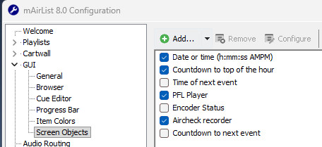
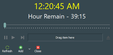
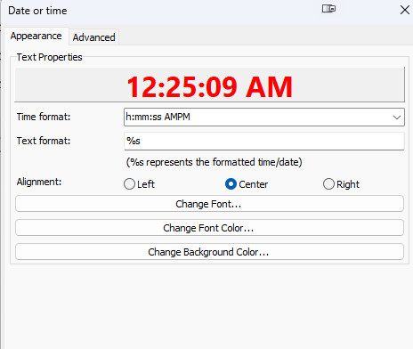
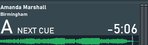
The line of ‘Time’ started to shrink and expand lengthwise. For example, when a number hits ‘1’ the whole line shrinks, and as soon as it hits a thicker number like ‘2’ the whole line expands. So it’s bouncing around and looks terrible. This must be a padding issue, if that’s the correct term. I’m not sure how to explain this, but for example go into this section and try using the Bahnschrift font and you will see what I mean. Then if you open the main mAirlist window it will also be shifting left and right depending on the numbers physical shape/thickness.
Can we get a fix for this? Should be pretty easy. Thanks!
Oh? How we know which are monosaced? Isn’t there a way to fix/correct this behavior so we can use any font or is this a universal issue even outside mAirlist?
There are proportional fonts which do include two sets of figures: one for typing text and a monospaced one for tables and the like. So the font itself doesn’t have to be monospaced in its entirety.