Hi,
is there a solution in the current mAirList version to display the artist and title in the playlist in a similar way to the previous version?
By default the two are displayed in one line, but I would like to put them below each other.
Hi,
is there a solution in the current mAirList version to display the artist and title in the playlist in a similar way to the previous version?
By default the two are displayed in one line, but I would like to put them below each other.
Is there a change?
Its still Artist - Title (%a - %b)
Edit: sorry you talk about the Playout not the Encoder. My fault
Yes, the playlist, but thanks for your comment!![]()
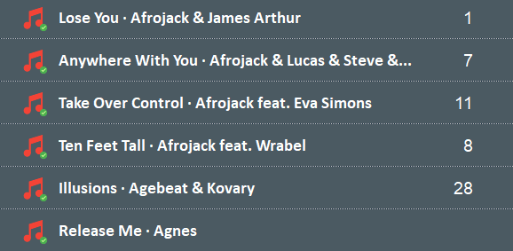
Here’s my playlist (7.2.5):

and here’s an old playlist:

I think it’s more beautiful broken down into lines
I have it as follows in the skin editor:
[Playlist]
IconSize=45
IconColumnWidth=50
TitleDisplayMode=VSplitTitleArtist
RowHeight=40
RowPadding=10
and looks similar to the v6 to me
Wow, very cool! Thank you!